pacman::p_load(plotly,
               DT,
               patchwork,
               tidyverse,
               ggstatsplot,
               readxl,
               performance,
               parameters,
               see,
gtsummary)In-class Exercise 04
exam_data <- read_csv("Data/Exam_data.csv")1 Creating an interactive scatter plot using ggplotly() method
plot_ly(data = exam_data,
        x = ~MATHS,
        y = ~ENGLISH,
        color = ~RACE)
p <- ggplot(data=exam_data,
aes(x = MATHS,
y = ENGLISH)) +
geom_point(dotsize = 1) +
coord_cartesian(xlim=c(0,100),
ylim=c(0,100))
ggplotly(p)By using ggplotly, the plot has been enabled with interactivity. Take note that those aesthetic elements are not supported to be customised inside ggplot here.
2 Visual Statistical Analysis with ggstatsplot
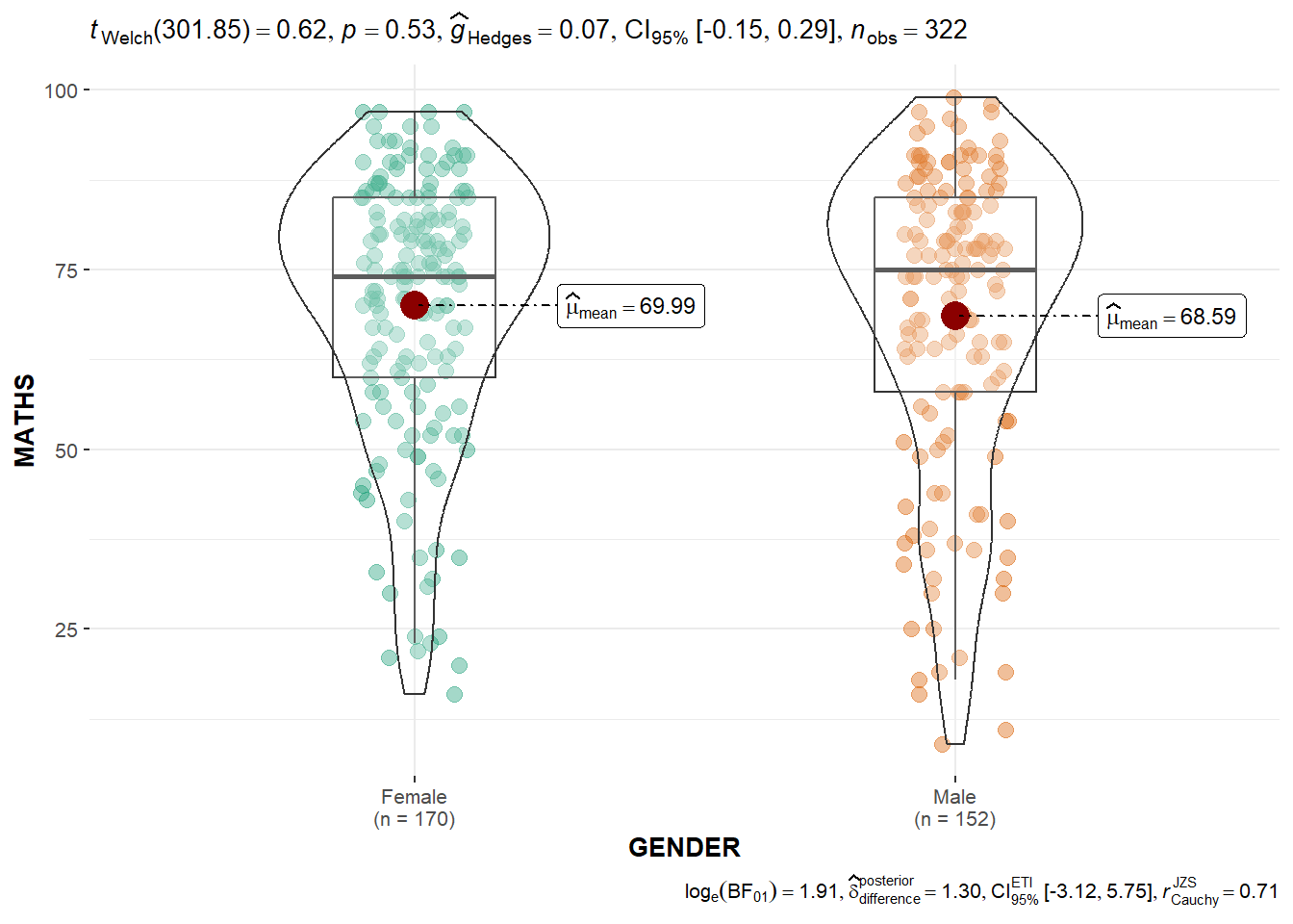
2.1 Two-sample mean test using ggbetweenstats()
ggbetweenstats(
  data = exam_data,
  x = GENDER,
  y = MATHS,
  type = "p",
  messages = FALSE
)
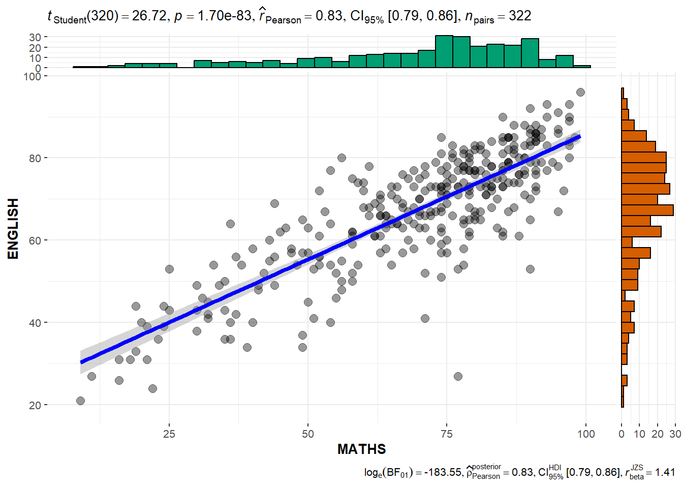
2.2 Build a visual for Significant Test of Correlation using ggscatterstats()
ggscatterstats(
  data = exam_data,
  x = MATHS,
  y = ENGLISH,
  marginal = TRUE,
  )
car_resale <- read_xls("Data/ToyotaCorolla.xls",
                       "data")

car_resale
# A tibble: 1,436 × 38
Id Model Price Age_0…¹ Mfg_M…² Mfg_Y…³ KM Quart…⁴ Weight Guara…⁵
<dbl> <chr> <dbl> <dbl> <dbl> <dbl> <dbl> <dbl> <dbl> <dbl>
1 81 TOYOTA Cor… 18950 25 8 2002 20019 100 1180 3
2 1 TOYOTA Cor… 13500 23 10 2002 46986 210 1165 3
3 2 TOYOTA Cor… 13750 23 10 2002 72937 210 1165 3
4 3 TOYOTA Co… 13950 24 9 2002 41711 210 1165 3
5 4 TOYOTA Cor… 14950 26 7 2002 48000 210 1165 3
6 5 TOYOTA Cor… 13750 30 3 2002 38500 210 1170 3
7 6 TOYOTA Cor… 12950 32 1 2002 61000 210 1170 3
8 7 TOYOTA Co… 16900 27 6 2002 94612 210 1245 3
9 8 TOYOTA Cor… 18600 30 3 2002 75889 210 1245 3
10 44 TOYOTA Cor… 16950 27 6 2002 110404 234 1255 3
# … with 1,426 more rows, 28 more variables: HP_Bin <chr>, CC_bin <chr>,
# Doors <dbl>, Gears <dbl>, Cylinders <dbl>, Fuel_Type <chr>, Color <chr>,
# Met_Color <dbl>, Automatic <dbl>, Mfr_Guarantee <dbl>,
# BOVAG_Guarantee <dbl>, ABS <dbl>, Airbag_1 <dbl>, Airbag_2 <dbl>,
# Airco <dbl>, Automatic_airco <dbl>, Boardcomputer <dbl>, CD_Player <dbl>,
# Central_Lock <dbl>, Powered_Windows <dbl>, Power_Steering <dbl>,
# Radio <dbl>, Mistlamps <dbl>, Sport_Model <dbl>, Backseat_Divider <dbl>, …model <- lm(Price ~ Age_08_04 + Mfg_Year + KM +
Weight + Guarantee_Period, data = car_resale)
model
Call:
lm(formula = Price ~ Age_08_04 + Mfg_Year + KM + Weight + Guarantee_Period,
    data = car_resale)

Coefficients:
     (Intercept)         Age_08_04          Mfg_Year                KM
      -2.637e+06        -1.409e+01         1.315e+03        -2.323e-02
          Weight  Guarantee_Period
       1.903e+01         2.770e+01
lm is an original R function building a linear regression model.
tbl_regression(model,
intercept = TRUE)| Characteristic | Beta | 95% CI1 | p-value |
|---|---|---|---|
| (Intercept) | -2,636,783 | -3,150,331, -2,123,236 | <0.001 |
| Age_08_04 | -14 | -35, 7.1 | 0.2 |
| Mfg_Year | 1,315 | 1,059, 1,571 | <0.001 |
| KM | -0.02 | -0.03, -0.02 | <0.001 |
| Weight | 19 | 17, 21 | <0.001 |
| Guarantee_Period | 28 | 3.8, 52 | 0.023 |
| 1 CI = Confidence Interval | |||
check_c <- check_collinearity(model)
plot(check_c)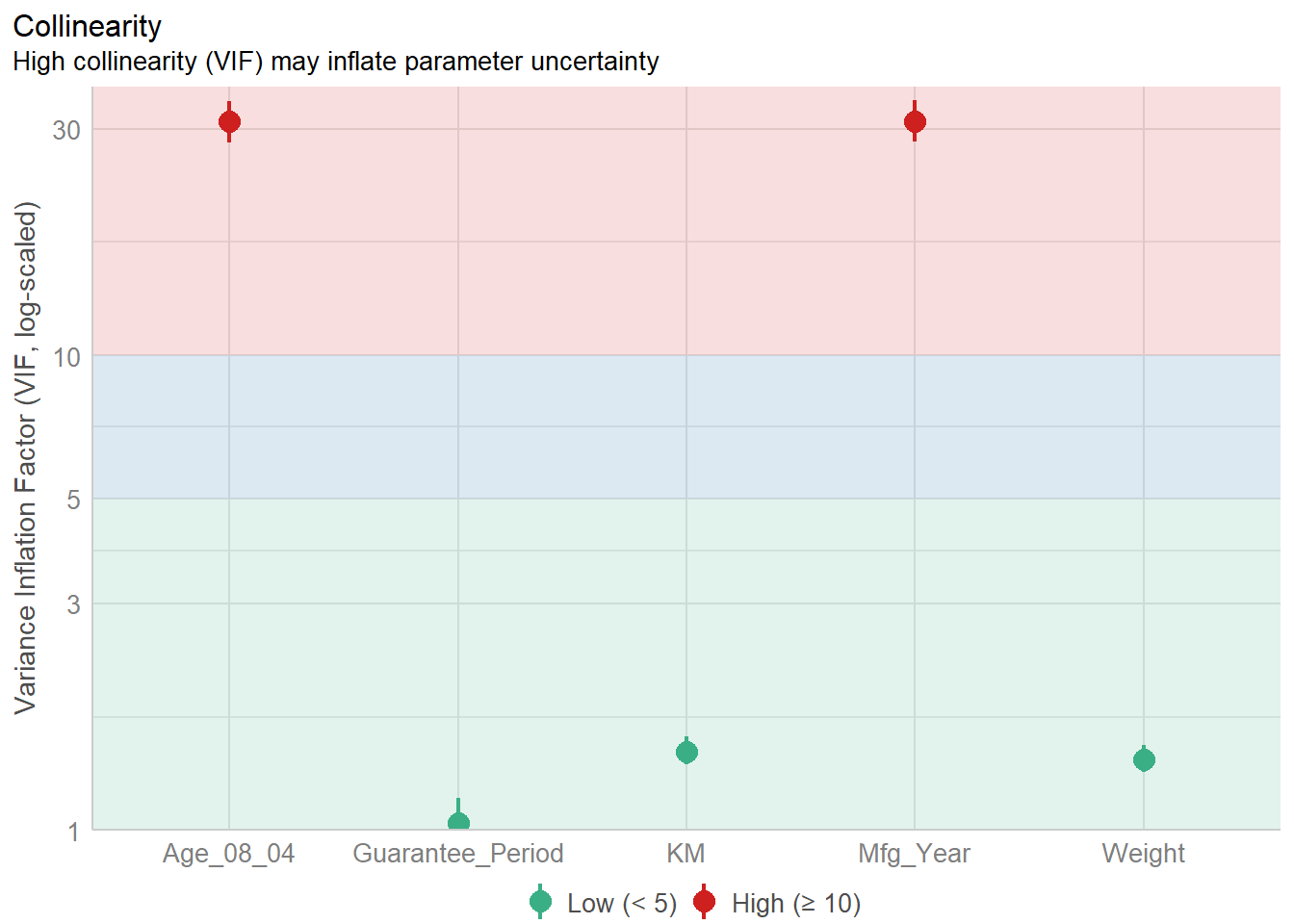
model_n <- lm(Price ~ Age_08_04 + KM +
              Weight + Guarantee_Period, data = car_resale)
check_n <- check_normality(model_n)
plot(check_n)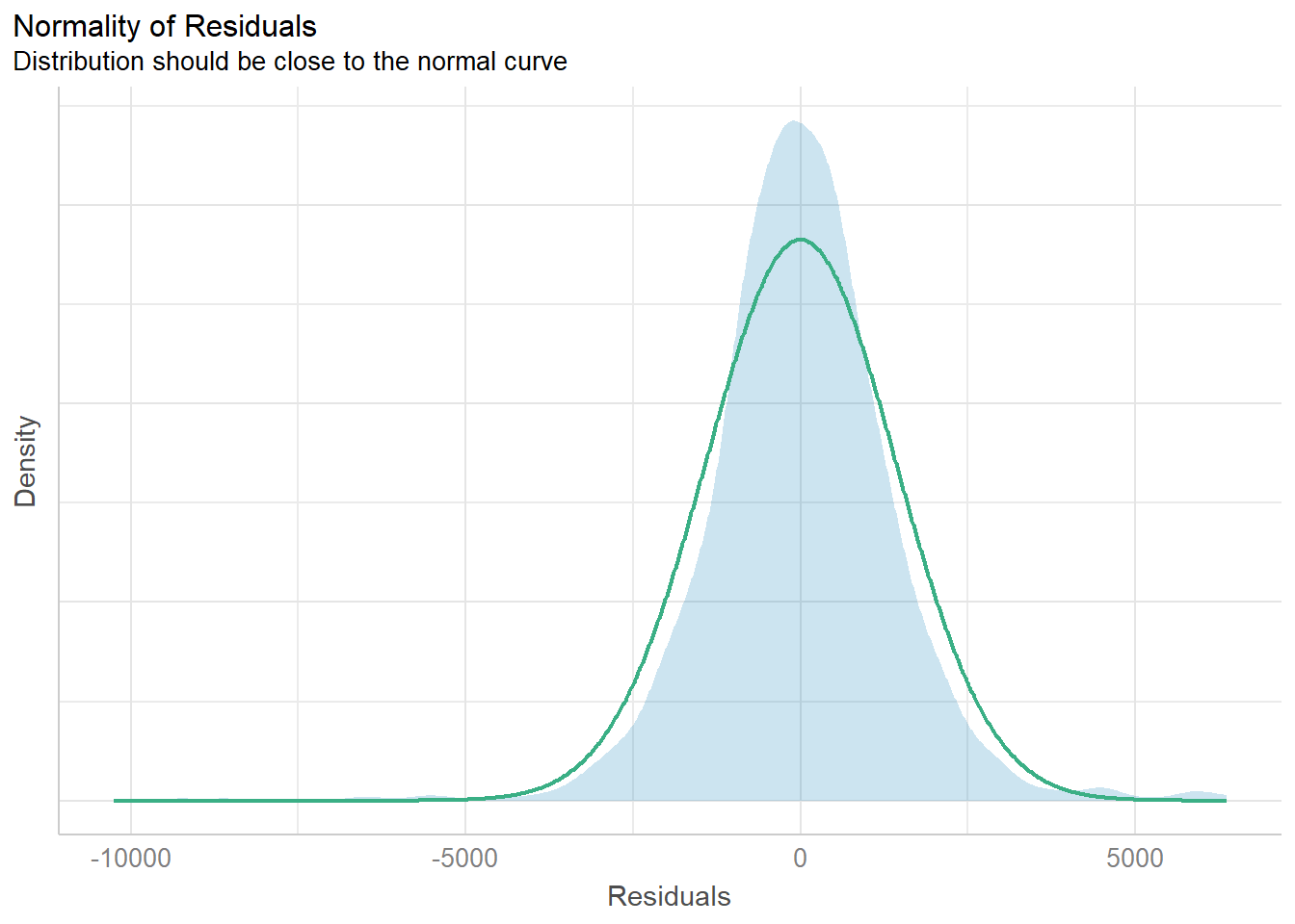
check_h <- check_heteroscedasticity(model_n)
plot(check_h)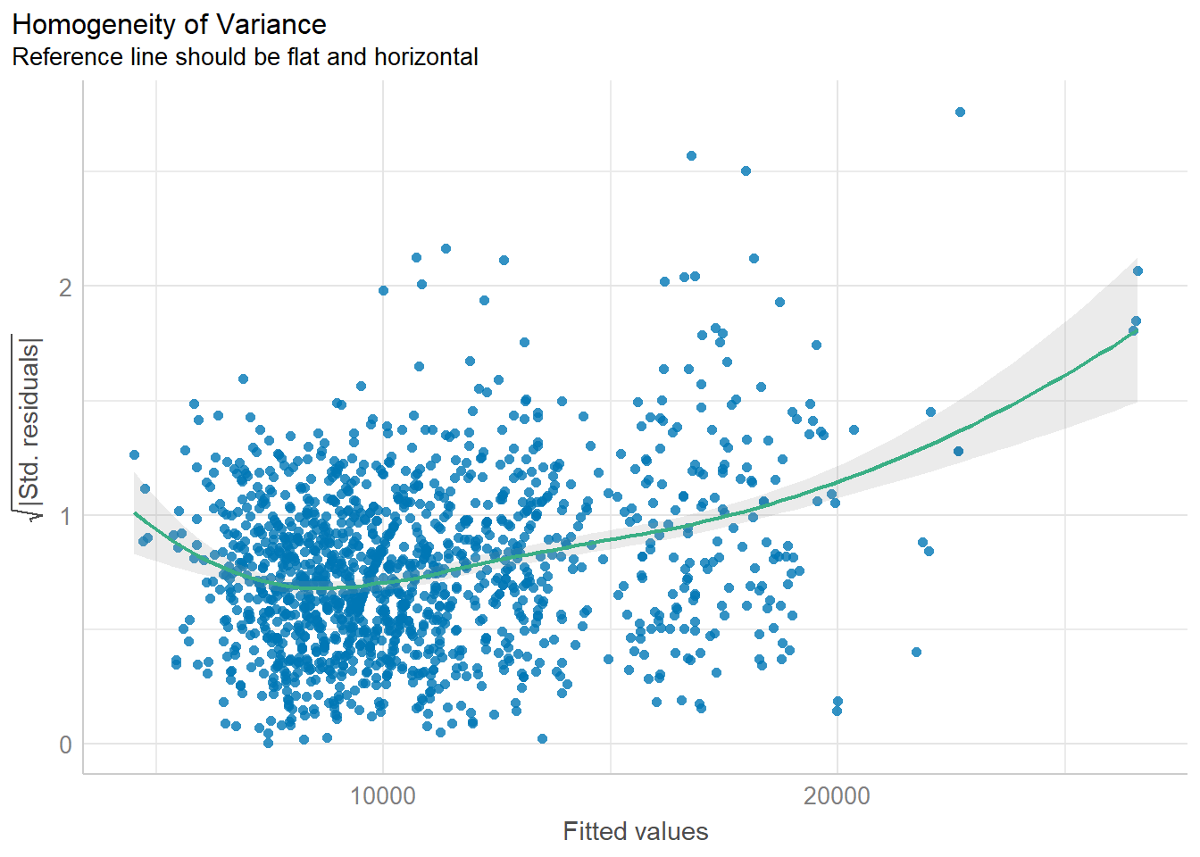
ggcoefstats(model_n,
            output = "plot")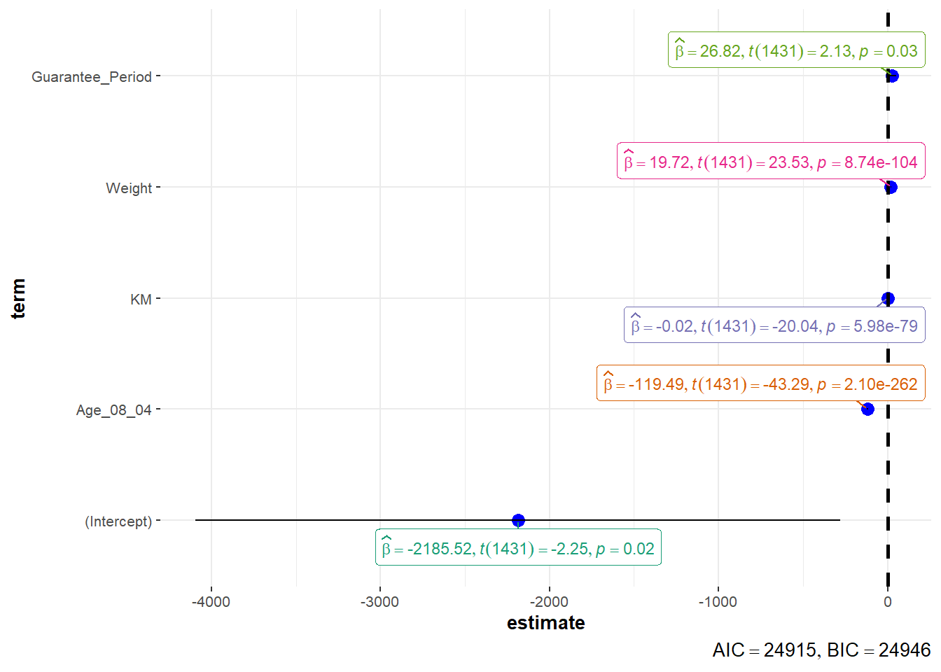
3 Visualizing the uncertainty of point estimates: ggplot2 methods
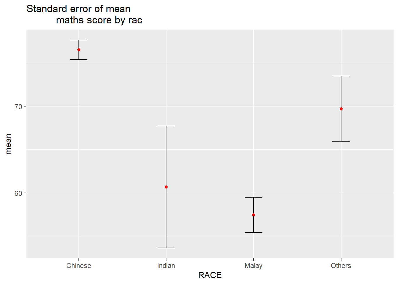
my_sum <- exam_data %>%
  group_by(RACE) %>%
  summarise(
    n=n(),
    mean=mean(MATHS),
    sd=sd(MATHS)
    ) %>%
mutate(se=sd/sqrt(n-1))knitr::kable(head(my_sum), format = 'html')| RACE | n | mean | sd | se |
|---|---|---|---|---|
| Chinese | 193 | 76.50777 | 15.69040 | 1.132357 |
| Indian | 12 | 60.66667 | 23.35237 | 7.041005 |
| Malay | 108 | 57.44444 | 21.13478 | 2.043177 |
| Others | 9 | 69.66667 | 10.72381 | 3.791438 |
ggplot(my_sum) +
  geom_errorbar(
    aes(x=RACE,
        ymin=mean-se,
        ymax=mean+se),
    width=0.2,
    colour="black",
    alpha=0.9,
    linewidth=0.5) +
  geom_point(aes
           (x=RACE,
            y=mean),
           stat="identity",
           color="red",
           size = 1.5,
           alpha=1) +
  ggtitle("Standard error of mean
          maths score by rac")