pacman::p_load(lubridate,
               ggthemes,
               reactable,
               reactablefmtr,
               gt,
               gtExtras,
tidyverse)Hands-on_Ex09: Information Dashboard Design using R
1 Packages installation
Take note that - gtExtras provides some additional helper functions to assist in creating beautiful tables with gt, an R package specially designed for anyone to make wonderful-looking tables using the R programming language.
- reactablefmtr provides various features to streamline and enhance the styling of interactive reactable tables with easy-to-use and highly-customizable functions and themes.
2 Data
2.1 Dataset
For this exercise, a personal database in Microsoft Access mdb format called Coffee Chain will be used.
To import that, odbcConnectAccess() from RODBC package will be used.
library(RODBC)
con <- odbcConnectAccess('data/Coffee Chain.mdb')
coffeechain <- sqlFetch(con, 'CoffeeChain Query')
write_rds(coffeechain, "data/CoffeeChain.rds")
odbcClose(con)
2.2 Data preparation
This step below is used if coffeechain is already available in R.
coffeechain <- read_rds("data/CoffeeChain.rds")Sales and Budgeted Sales data at Product level is aggregated below.
product <- coffeechain %>%
  group_by(`Product`) %>%
  summarise(`target` = sum(`Budget Sales`),
            `current` = sum(`Sales`)) %>%
  ungroup()
3 Bullet chart in ggplot2
ggplot(product, aes(Product, current)) +
  geom_col(aes(Product, max(target) * 1.01),
           fill="grey85", width=0.85) +
  geom_col(aes(Product, target * 0.75),
           fill="grey60", width=0.85) +
  geom_col(aes(Product, target * 0.5),
           fill="grey50", width=0.85) +
  geom_col(aes(Product, current),
           width=0.35,
           fill = "black") +
  geom_errorbar(aes(y = target,
                    x = Product,
                    ymin = target,
                    ymax= target),
                width = .4,
                colour = "red",
                linewidth = 1) +
  coord_flip()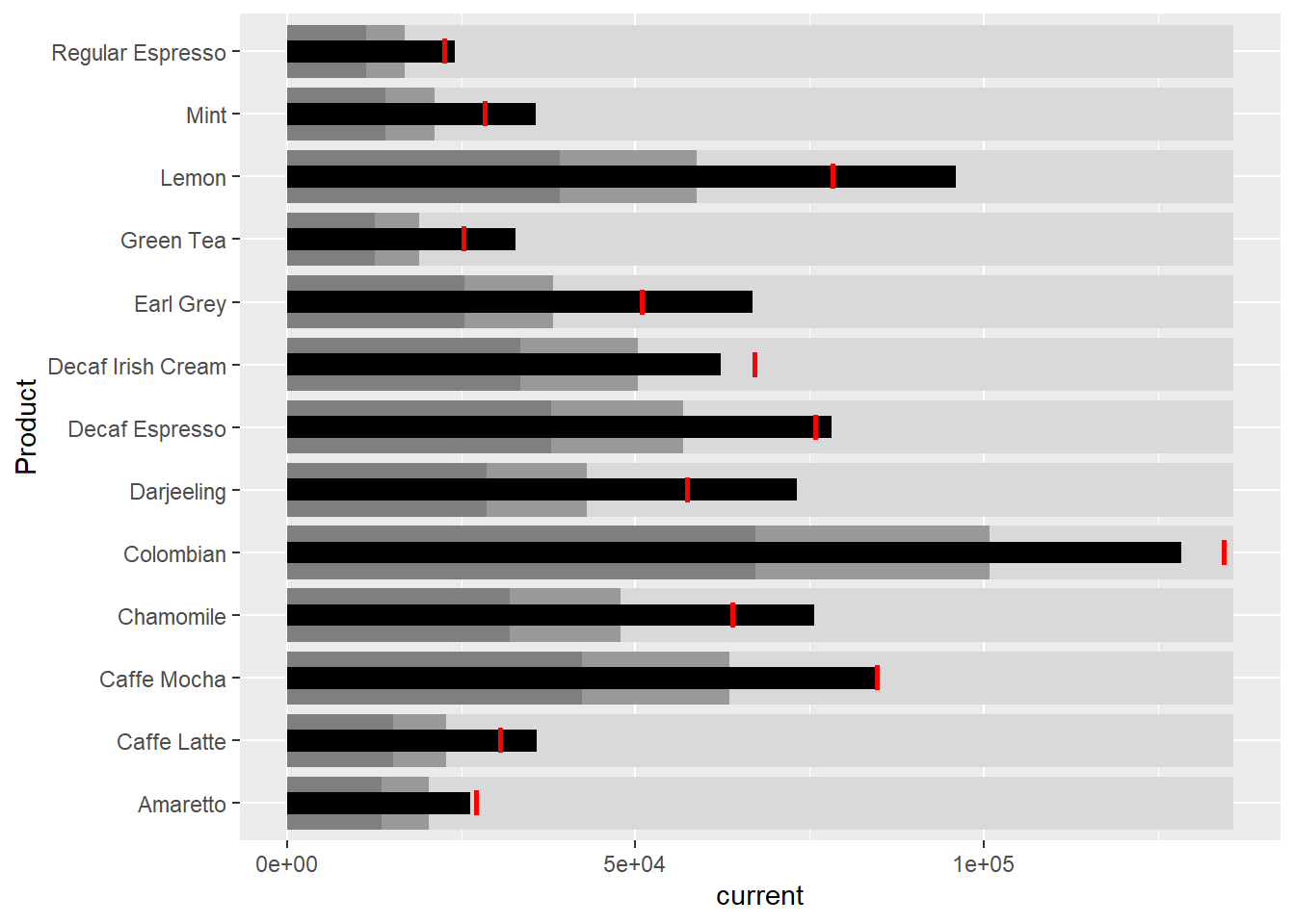
4 Sparklines in ggplot2
sales_report <- coffeechain %>%
  filter(Date >= "2013-01-01") %>%
  mutate(Month = month(Date)) %>%
  group_by(Month, Product) %>%
  summarise(Sales = sum(Sales)) %>%
  ungroup() %>%
  select(Month, Product, Sales)
Minimum, maximum, 25th & 75th percentiles are prepared below. End of the month sales are also prepared.
mins <- group_by(sales_report, Product) %>%
  slice(which.min(Sales))
maxs <- group_by(sales_report, Product) %>%
  slice(which.max(Sales))
ends <- group_by(sales_report, Product) %>%
  filter(Month == max(Month))
quarts <- sales_report %>%
group_by(Product) %>%
summarise(quart1 = quantile(Sales,
0.25),
quart2 = quantile(Sales,
0.75)) %>%
right_join(sales_report)ggplot(sales_report, aes(x=Month, y=Sales)) +
facet_grid(Product ~ ., scales = "free_y") +
geom_ribbon(data = quarts, aes(ymin = quart1, max = quart2),
fill = 'grey90') +
geom_line(size=0.3) +
geom_point(data = mins, col = 'red') +
geom_point(data = maxs, col = 'blue') +
geom_text(data = mins, aes(label = Sales), vjust = -1) +
geom_text(data = maxs, aes(label = Sales), vjust = 2.5) +
geom_text(data = ends, aes(label = Sales), hjust = 0, nudge_x = 0.5) +
geom_text(data = ends, aes(label = Product), hjust = 0, nudge_x = 1) +
expand_limits(x = max(sales_report$Month) +
(0.25 * (max(sales_report$Month) - min(sales_report$Month)))) +
scale_x_continuous(breaks = seq(1, 12, 1)) +
scale_y_continuous(expand = c(0.1, 0)) +
theme_tufte(base_size = 3, base_family = "Helvetica") +
theme(axis.title=element_blank(), axis.text.y = element_blank(),
axis.ticks = element_blank(), strip.text = element_blank())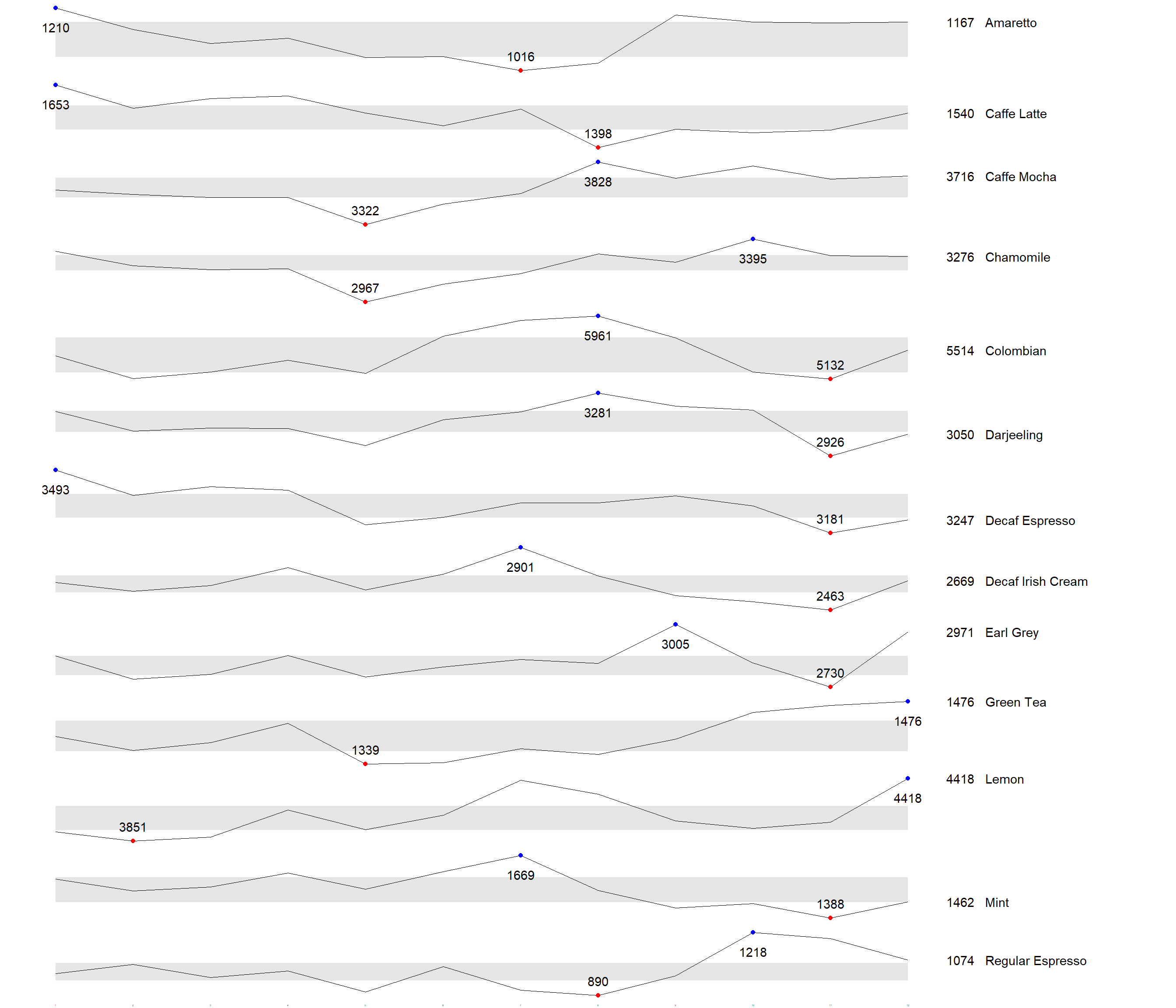
5 Static information dashboard design using gt and gtExtras
5.1 Simeple bullet chart
product %>%
  gt::gt() %>%
  gt_plt_bullet(column = current,
              target = target,
              width = 60,
              palette = c("lightblue",
                          "black")) %>%
gt_theme_538()| Product | current |
|---|---|
| Amaretto | |
| Caffe Latte | |
| Caffe Mocha | |
| Chamomile | |
| Colombian | |
| Darjeeling | |
| Decaf Espresso | |
| Decaf Irish Cream | |
| Earl Grey | |
| Green Tea | |
| Lemon | |
| Mint | |
| Regular Espresso |
5.2 Sparklines using gtExtras
report <- coffeechain %>%
  mutate(Year = year(Date)) %>%
  filter(Year == "2013") %>%
  mutate (Month = month(Date,
                        label = TRUE,
                        abbr = TRUE)) %>%
  group_by(Product, Month) %>%
  summarise(Sales = sum(Sales)) %>%
  ungroup()
Take note that one of the requirements of gtExtras functions is that almost exclusively they require you to pass data.frame with list columns. In view of this, code chunk below will be used to convert the report data.frame into list columns.
report %>%
  group_by(Product) %>%
  summarize('Monthly Sales' = list(Sales),
            .groups = "drop")
# A tibble: 13 × 2
Product `Monthly Sales`
<chr> <list>
1 Amaretto <dbl [12]>
2 Caffe Latte <dbl [12]>
3 Caffe Mocha <dbl [12]>
4 Chamomile <dbl [12]>
5 Colombian <dbl [12]>
6 Darjeeling <dbl [12]>
7 Decaf Espresso <dbl [12]>
8 Decaf Irish Cream <dbl [12]>
9 Earl Grey <dbl [12]>
10 Green Tea <dbl [12]>
11 Lemon <dbl [12]>
12 Mint <dbl [12]>
13 Regular Espresso <dbl [12]> report %>%
group_by(Product) %>%
summarize('Monthly Sales' = list(Sales),
.groups = "drop") %>%
gt() %>%
gt_plt_sparkline('Monthly Sales')| Product | Monthly Sales |
|---|---|
| Amaretto | |
| Caffe Latte | |
| Caffe Mocha | |
| Chamomile | |
| Colombian | |
| Darjeeling | |
| Decaf Espresso | |
| Decaf Irish Cream | |
| Earl Grey | |
| Green Tea | |
| Lemon | |
| Mint | |
| Regular Espresso |
5.3 To add statistics elements
report %>%
  group_by(Product) %>%
  summarise("Min" = min(Sales, na.rm = T),
            "Max" = max(Sales, na.rm = T),
            "Average" = mean(Sales, na.rm = T)
            ) %>%
  gt() %>%
  fmt_number(columns = 4,
decimals = 2)| Product | Min | Max | Average |
|---|---|---|---|
| Amaretto | 1016 | 1210 | 1,119.00 |
| Caffe Latte | 1398 | 1653 | 1,528.33 |
| Caffe Mocha | 3322 | 3828 | 3,613.92 |
| Chamomile | 2967 | 3395 | 3,217.42 |
| Colombian | 5132 | 5961 | 5,457.25 |
| Darjeeling | 2926 | 3281 | 3,112.67 |
| Decaf Espresso | 3181 | 3493 | 3,326.83 |
| Decaf Irish Cream | 2463 | 2901 | 2,648.25 |
| Earl Grey | 2730 | 3005 | 2,841.83 |
| Green Tea | 1339 | 1476 | 1,398.75 |
| Lemon | 3851 | 4418 | 4,080.83 |
| Mint | 1388 | 1669 | 1,519.17 |
| Regular Espresso | 890 | 1218 | 1,023.42 |
5.4 To combine the data frame
spark <- report %>%
  group_by(Product) %>%
  summarize('Monthly Sales' = list(Sales),
            .groups = "drop")

sales <- report %>%
  group_by(Product) %>%
  summarise("Min" = min(Sales, na.rm = T),
            "Max" = max(Sales, na.rm = T),
            "Average" = mean(Sales, na.rm = T)
            )

sales_data = left_join(sales, spark)
5.5 Plot the updated data table
sales_data %>%
  gt() %>%
gt_plt_sparkline('Monthly Sales')| Product | Min | Max | Average | Monthly Sales |
|---|---|---|---|---|
| Amaretto | 1016 | 1210 | 1119.000 | |
| Caffe Latte | 1398 | 1653 | 1528.333 | |
| Caffe Mocha | 3322 | 3828 | 3613.917 | |
| Chamomile | 2967 | 3395 | 3217.417 | |
| Colombian | 5132 | 5961 | 5457.250 | |
| Darjeeling | 2926 | 3281 | 3112.667 | |
| Decaf Espresso | 3181 | 3493 | 3326.833 | |
| Decaf Irish Cream | 2463 | 2901 | 2648.250 | |
| Earl Grey | 2730 | 3005 | 2841.833 | |
| Green Tea | 1339 | 1476 | 1398.750 | |
| Lemon | 3851 | 4418 | 4080.833 | |
| Mint | 1388 | 1669 | 1519.167 | |
| Regular Espresso | 890 | 1218 | 1023.417 |
5.6 To combine with bullet chart and sparklines
bullet <- coffeechain %>%
  filter(Date >= "2013-01-01") %>%
  group_by(`Product`) %>%
  summarise(`Target` = sum(`Budget Sales`),
            `Actual` = sum(`Sales`)) %>%
  ungroup()

sales_data = sales_data %>%
  left_join(bullet)

sales_data %>%
  gt() %>%
  gt_plt_sparkline('Monthly Sales') %>%
  gt_plt_bullet(column = Actual,
                target = Target,
                width = 28,
                palette = c("lightblue",
                          "black")) %>%
gt_theme_538()| Product | Min | Max | Average | Monthly Sales | Actual |
|---|---|---|---|---|---|
| Amaretto | 1016 | 1210 | 1119.000 | ||
| Caffe Latte | 1398 | 1653 | 1528.333 | ||
| Caffe Mocha | 3322 | 3828 | 3613.917 | ||
| Chamomile | 2967 | 3395 | 3217.417 | ||
| Colombian | 5132 | 5961 | 5457.250 | ||
| Darjeeling | 2926 | 3281 | 3112.667 | ||
| Decaf Espresso | 3181 | 3493 | 3326.833 | ||
| Decaf Irish Cream | 2463 | 2901 | 2648.250 | ||
| Earl Grey | 2730 | 3005 | 2841.833 | ||
| Green Tea | 1339 | 1476 | 1398.750 | ||
| Lemon | 3851 | 4418 | 4080.833 | ||
| Mint | 1388 | 1669 | 1519.167 | ||
| Regular Espresso | 890 | 1218 | 1023.417 |