pacman::p_load(lubridate, tidyquant, ggHoriPlot,
timetk, ggthemes, plotly, tidyverse)Hands-on Ex10: Financial Data Visulaization and Analysis
This hands-on exercise aims to perform below tasks:
extract stock price data from financial portal such as Yahoo Finance by using tidyquant package,
plot horizon graph by using ggHoriPlot package,
plot static and interactive stock prices line graph(s) by ggplot2 and plotly R packages,
plot static candlestick chart by using tidyquant package,
plot static bollinger bands by using tidyquant,
and plot interactive candlestick chart by using ggplot2 and plotly R.
1 Loading libraries
tidyquant bringing business and financial analysis to the 'tidyverse'. It provides a convenient wrapper to various 'xts', 'zoo', 'quantmod', 'TTR' and 'PerformanceAnalytics' package functions and returns the objects in the tidy 'tibble' format.
ggHoriPlot: A user-friendly, highly customisable R package for building horizon plots in the 'ggplot2' environment.
company <- read_csv("data/companySG.csv")
Top40 <- company %>%
  slice_max(`marketcap`, n=40) %>%
  select(symbol)
Stock40_daily <- Top40 %>%
tq_get(get = "stock.prices",
from = "2020-01-01",
to = "2023-03-24") %>%
group_by(symbol) %>%
tq_transmute(select = NULL,
mutate_fun = to.period,
period = "days")Stock40_daily %>%
ggplot() +
geom_horizon(aes(x = date, y=adjusted), origin = "midpoint", horizonscale = 6)+
facet_grid(symbol~.)+
theme_few() +
scale_fill_hcl(palette = 'RdBu') +
theme(panel.spacing.y=unit(0, "lines"), strip.text.y = element_text(
size = 5, angle = 0, hjust = 0),
legend.position = 'none',
axis.text.y = element_blank(),
axis.text.x = element_text(size=5),
axis.title.y = element_blank(),
axis.title.x = element_blank(),
axis.ticks.y = element_blank(),
panel.border = element_blank()
) +
scale_x_date(expand=c(0,0), date_breaks = "1 month", date_labels = "%b%y") +
ggtitle('Daily Adjusted Prices (Jan 2020 to Mar 2023)') 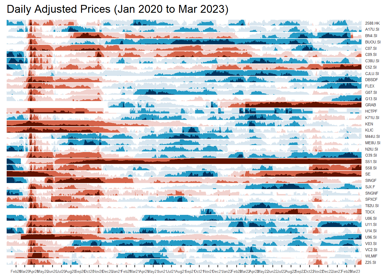
Stock40_daily <- Stock40_daily %>%
  left_join(company) %>%
  select(1:8, 11:12)
Stock40_daily %>%
ggplot() +
geom_horizon(aes(x = date, y=adjusted), origin = "midpoint", horizonscale = 6)+
facet_grid(Name~.)+ #<<
geom_vline(xintercept = as.Date("2020-03-11"), colour = "grey15", linetype = "dashed", size = 0.5)+ #<<
geom_vline(xintercept = as.Date("2020-12-14"), colour = "grey15", linetype = "dashed", size = 0.5)+ #<<
theme_few() +
scale_fill_hcl(palette = 'RdBu') +
theme(panel.spacing.y=unit(0, "lines"),
strip.text.y = element_text(size = 5, angle = 0, hjust = 0),
legend.position = 'none',
axis.text.y = element_blank(),
axis.text.x = element_text(size=7),
axis.title.y = element_blank(),
axis.title.x = element_blank(),
axis.ticks.y = element_blank(),
panel.border = element_blank()
) +
scale_x_date(expand=c(0,0), date_breaks = "1 month", date_labels = "%b%y") +
ggtitle('Daily Adjusted Prices (Jan 2020 to Mar 2023)') 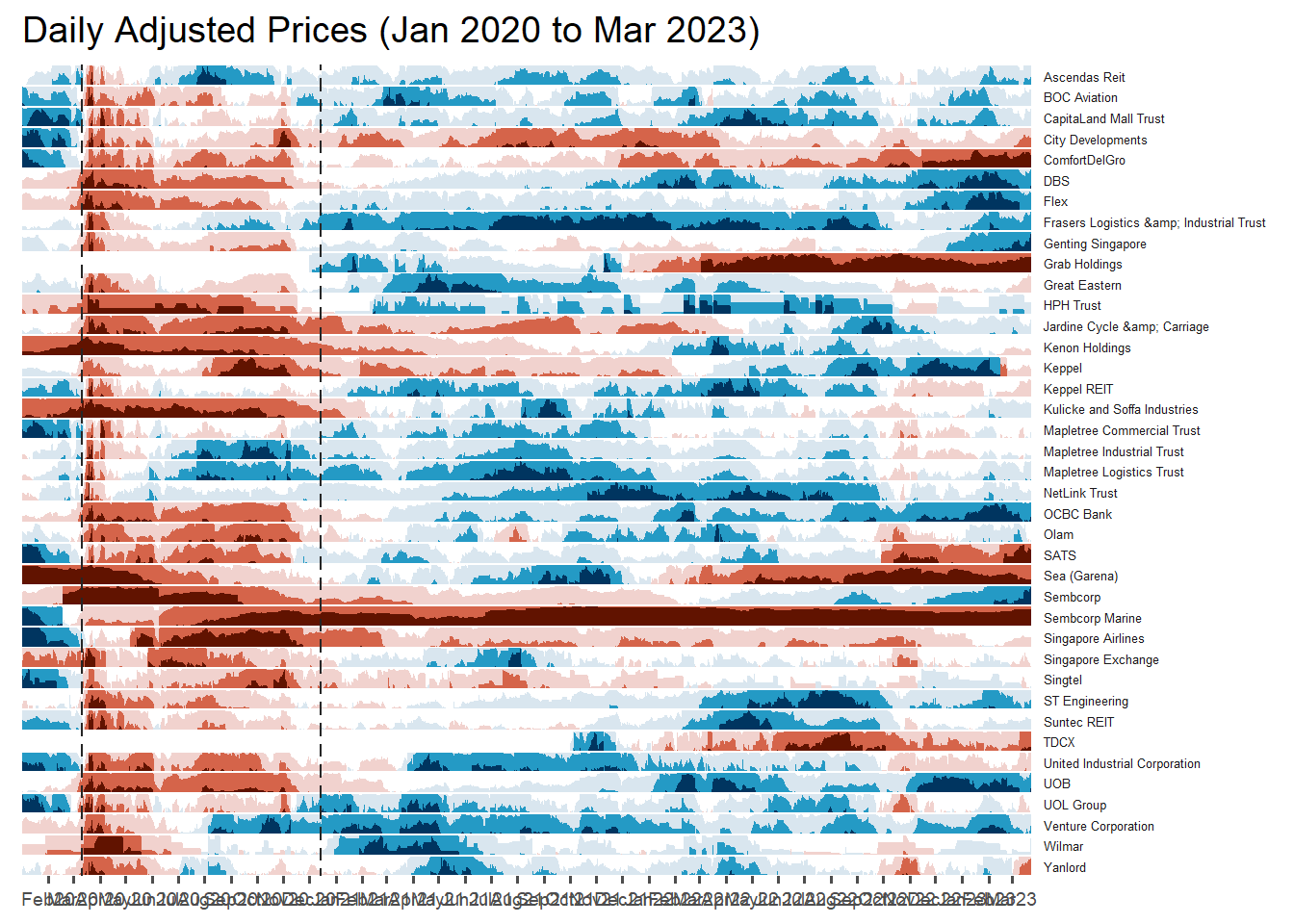
Stock40_daily %>%
  filter(symbol == "DBSDF") %>%
  ggplot(aes(x = date, y = close)) +
    geom_line() +
    labs(title = "DBS Group Holdings Ltd (DBSDF) Daily Stock Price",
         y = "Closing Price", x = "") +
    theme_tq()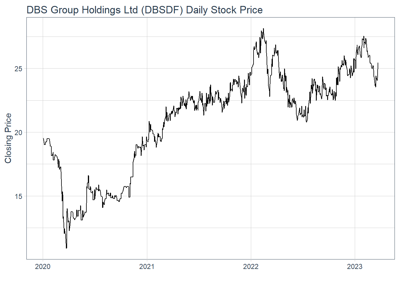
selected_stocks <-  Stock40_daily %>%
  filter (`symbol` == c("C09.SI", "SINGF", "SNGNF", "C52.SI"))
p <- ggplot(selected_stocks,
aes(x = date, y = adjusted)) +
scale_y_continuous() +
geom_line() +
facet_wrap(~Name, scales = "free_y",) +
theme_tq() +
labs(title = "Daily stock prices of selected weak stocks",
x = "", y = "Adjusted Price") +
theme(axis.text.x = element_text(size = 6),
axis.text.y = element_text(size = 6))
ggplotly(p)end <- as_date("2023-03-24")Stock40_daily %>%
filter(symbol == "DBSDF") %>%
ggplot(aes(
x = date, y = close)) +
geom_candlestick(aes(
open = open, high = high,
low = low, close = close)) +
geom_line(size = 0.5)+
coord_x_date(xlim = c(end - weeks(12),
end),
ylim = c(20, 35),
expand = TRUE) +
labs(title = "DBS Group Holdings Ltd (DBSDF) Daily Stock Price",
y = "Closing Price", x = "") +
theme_tq()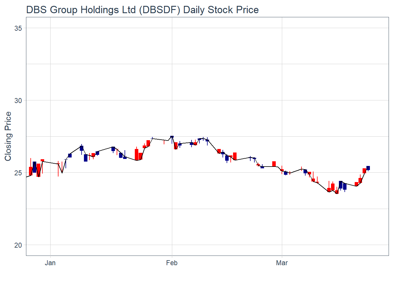
Stock40_daily %>%
  filter(symbol == "DBSDF") %>%
  ggplot(aes(
    x = date, y = close)) +
  geom_candlestick(aes(
    open = open, high = high,
    low = low, close = close)) +
  geom_line(size = 0.5)+
  geom_ma(color = "darkgreen", n = 20) +
  geom_ma(color = "lightgreen", n = 5) +
    coord_x_date(xlim = c(end - weeks(12),
                          end),
                 ylim = c(20, 35),
                 expand = TRUE) +
  labs(title = "DBS Group Holdings Ltd (DBSDF) Daily Stock Price",
       subtitle = "darkgreen = 1-day MA, lightgreen = 5-day MA",
       y = "Closing Price", x = "") +
  theme_tq()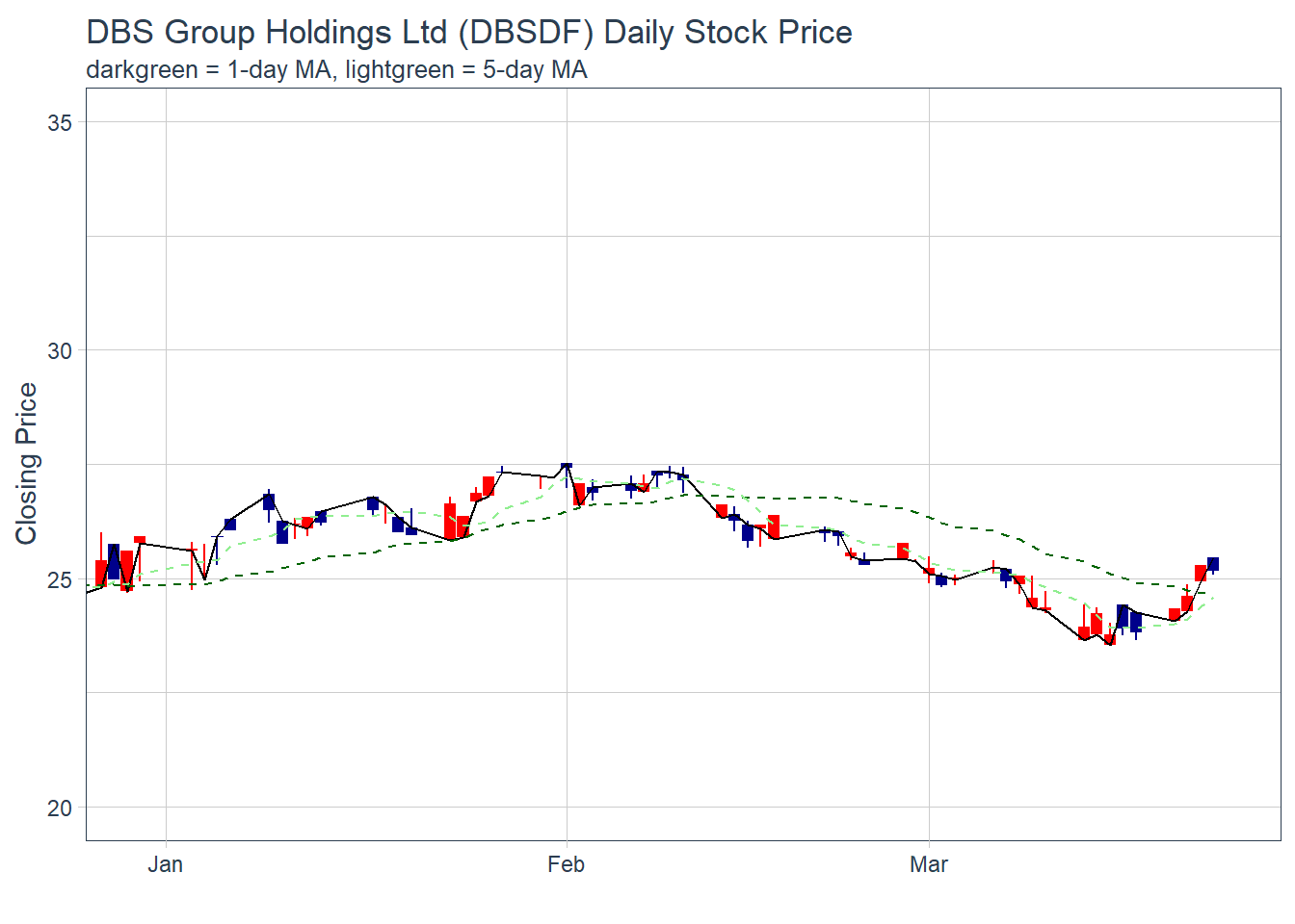
Stock40_daily %>%
  filter(symbol == "DBSDF") %>%
  ggplot(aes(x=date, y=close))+
  geom_line(size=0.5)+
  geom_bbands(aes(
    high = high, low = low, close = close),
    ma_fun = SMA, sd = 2, n = 20,
    size = 0.75, color_ma = "royalblue4",
    color_bands = "red1")+
    coord_x_date(xlim = c("2020-02-01",
                          "2023-03-24"),
                 expand = TRUE)+
    labs(title = "DBS Group Holdings Ltd (DBSDF) Daily Stock Price",
         subtitle = "dotted red lines = bollinger bands",
         x = "Date", y ="Price") +
theme(legend.position="none")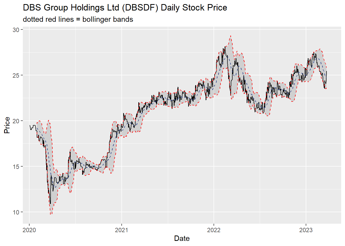
candleStick_plot<-function(symbol, from, to){
  tq_get(symbol, from = from, to = to, warnings = FALSE) %>%
    mutate(greenRed=ifelse(open-close>0, "Red", "Green")) %>%
    ggplot()+
    geom_segment(
      aes(x = date, xend=date, y =open, yend =close, colour=greenRed),
      size=3)+
    theme_tq()+
    geom_segment(
      aes(x = date, xend=date, y =high, yend =low, colour=greenRed))+
    scale_color_manual(values=c("ForestGreen","Red"))+
    ggtitle(paste0(symbol," (",from," - ",to,")"))+
    theme(legend.position ="none",
          axis.title.y = element_blank(),
          axis.title.x=element_blank(),
          axis.text.x = element_text(angle = 0, vjust = 0.5, hjust=1),
          plot.title= element_text(hjust=0.5))
}
p <- candleStick_plot("DBSDF",
from = '2022-01-01',
to = today())
ggplotly(p)