pacman::p_load(ggiraph,
               plotly,
               gganimate,
               DT,
               tidyverse,
patchwork)In-class Ex03
1 Installing and loading R packages
Packages that will be installed and loaded: ggiraph, plotly, gganimate, DT, tidyverse, patchwork. Noted that it is recommended to load tidyverse last so as to avoid some potential conflicting packages being used.
2 Importing data
exam_data <- read_csv("Data/Exam_data.csv")3 Tooltip effect with tooltip aesthetic (ggirafe)
Interactivity: By hovering the mouse pointer on an data point of interest, the student’s ID will be displayed.
Based on hands-on exercise 1, usually this is how a dot plot looks like. And this is a static plot.
p_old <- ggplot(data=exam_data,
                aes(x = MATHS)) +
  geom_dotplot(binwidth = 2.5,
               dotsize = 0.5) +
  scale_y_continuous(NULL,
                     breaks = NULL)

p_old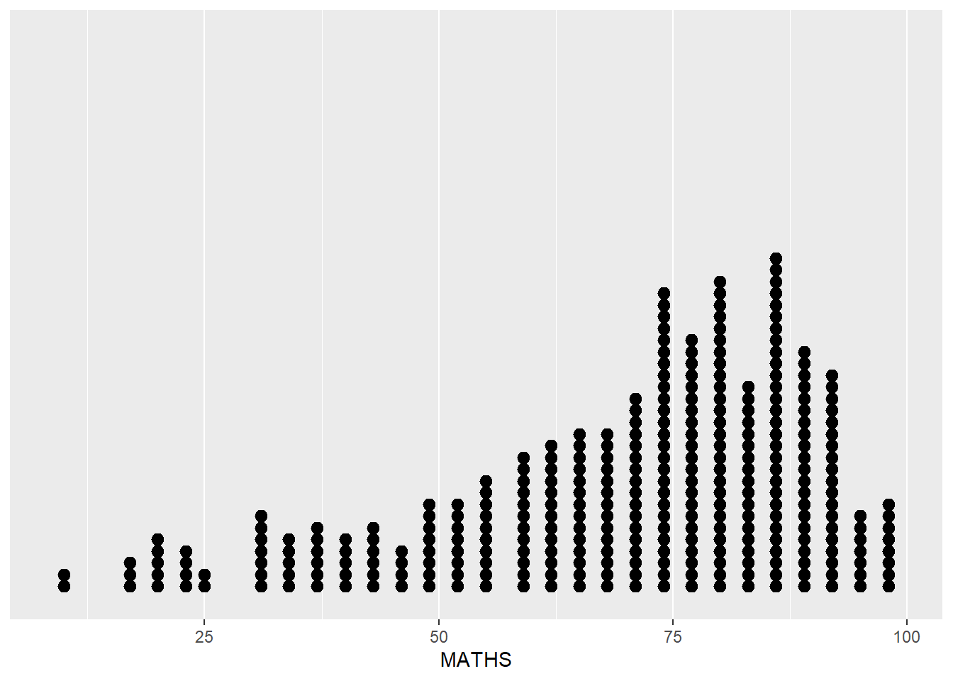
By using ggirafe, an interactive version of ggplot2 geom (i.e. geom_dotplot_interactive()) will be used to create the basic graph. Then, girafe() will be used to generate an svg object to be displayed on an html page.
p <- ggplot(data=exam_data,
       aes(x = MATHS)) +
  geom_dotplot_interactive(
    aes(tooltip = ID),
    stackgroups = TRUE,
    binwidth = 1,
    method = "histodot") +
  scale_y_continuous(NULL,
                     breaks = NULL)
girafe(
  ggobj = p,
  width_svg = 6,
  height_svg = 6*0.618
)
Remark: svg: Scalable vector graphics, the graph would scale accordingly on different devices to preserve the image quality.
4 Multiple information on tooltip
To present more information inside tooltip, a new data column could be created in order to store the information needed.
exam_data$tooltip <- c(paste0(
  "Name = ", exam_data$ID,
  "\n Class = ", exam_data$CLASS))

p <- ggplot(data=exam_data,
       aes(x = MATHS)) +
  geom_dotplot_interactive(
    aes(tooltip = exam_data$tooltip),
    stackgroups = TRUE,
    binwidth = 1,
    method = "histodot") +
  scale_y_continuous(NULL,
                     breaks = NULL)
girafe(
  ggobj = p,
  width_svg = 8,
  height_svg = 8*0.618
)
End
Testing